
TRLT | Brand Refresh | 2026
The requisite Luxury TravelBrand Design for a Luxury Travel Company
About The Business
TRLT was founded by two friends whose shared travel experiences and aviation careers inspired them to create a more elevated, concierge-style travel experience for others. They deliver professionally curated, luxury experiences to their clients by focusing on thoughtful details, seamless service, and attentive communication.
About The Goals
The goal for the brand identity was to create a feeling of luxurious comfort that speaks to their clients being at the center of every journey, and creating exceptional and enjoyable experiences from start to finish.
A Name Update
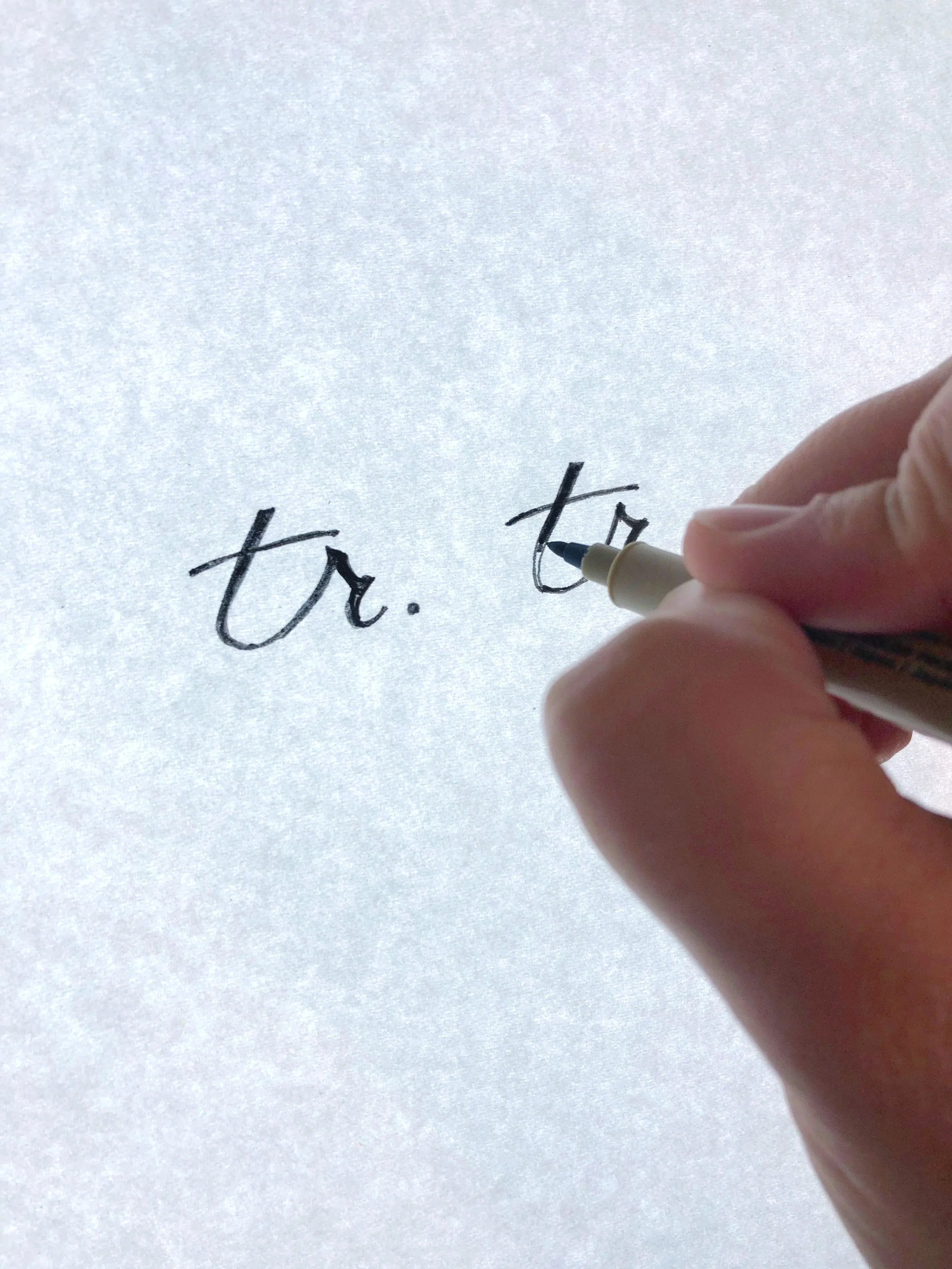
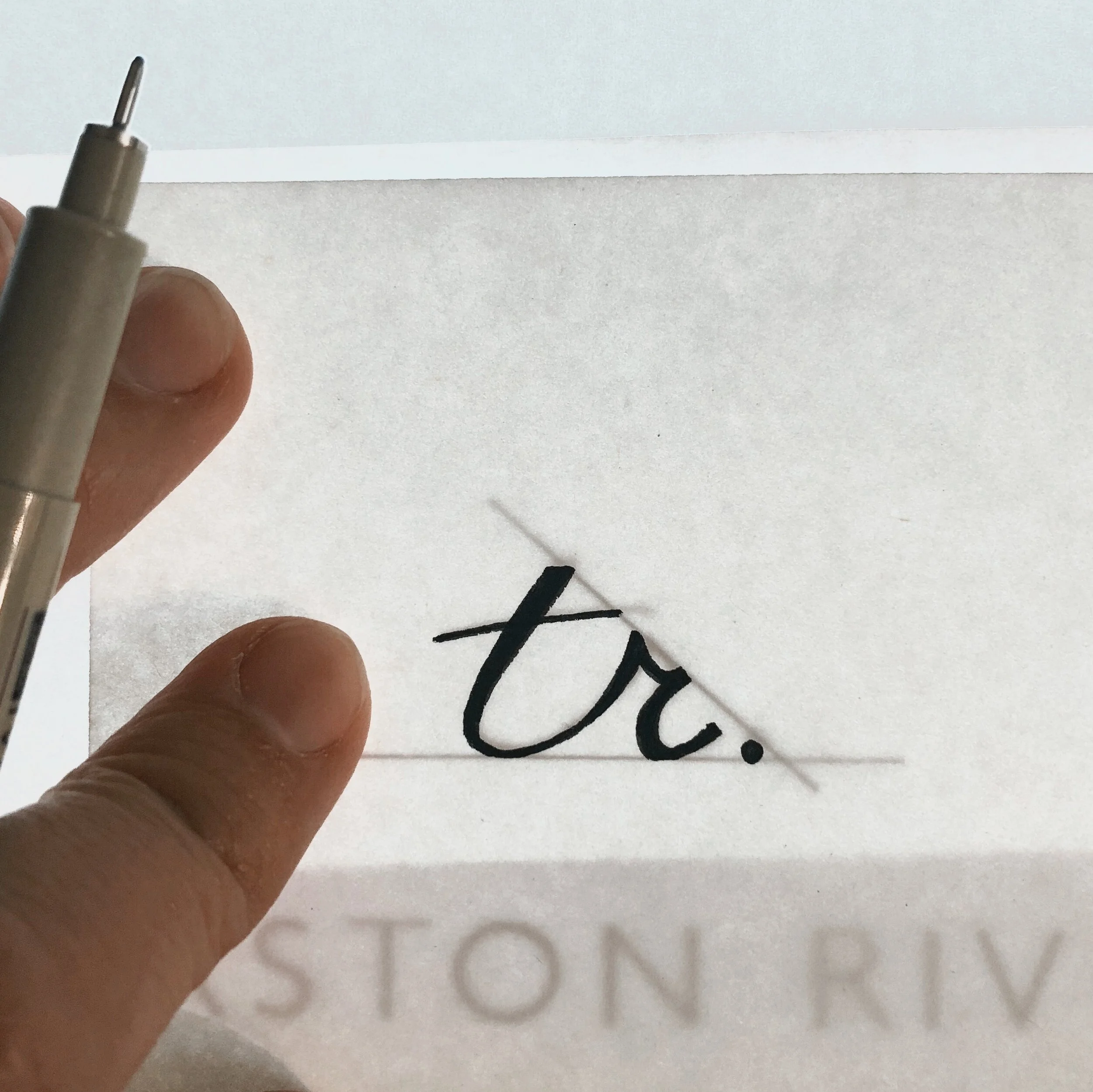
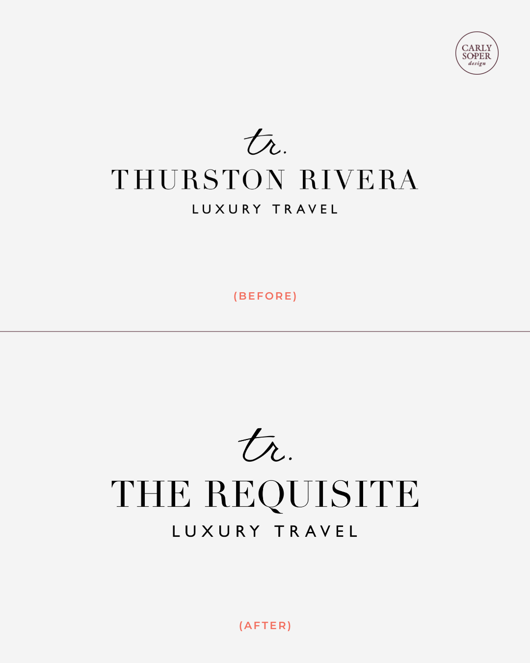
Several years after we built the brand, TRLT returned to me to update their logo for their business name change. They were still thrilled with their original logo and wanted to keep the look for brand recognition, but ensure the name was changed out as elegantly as possible.
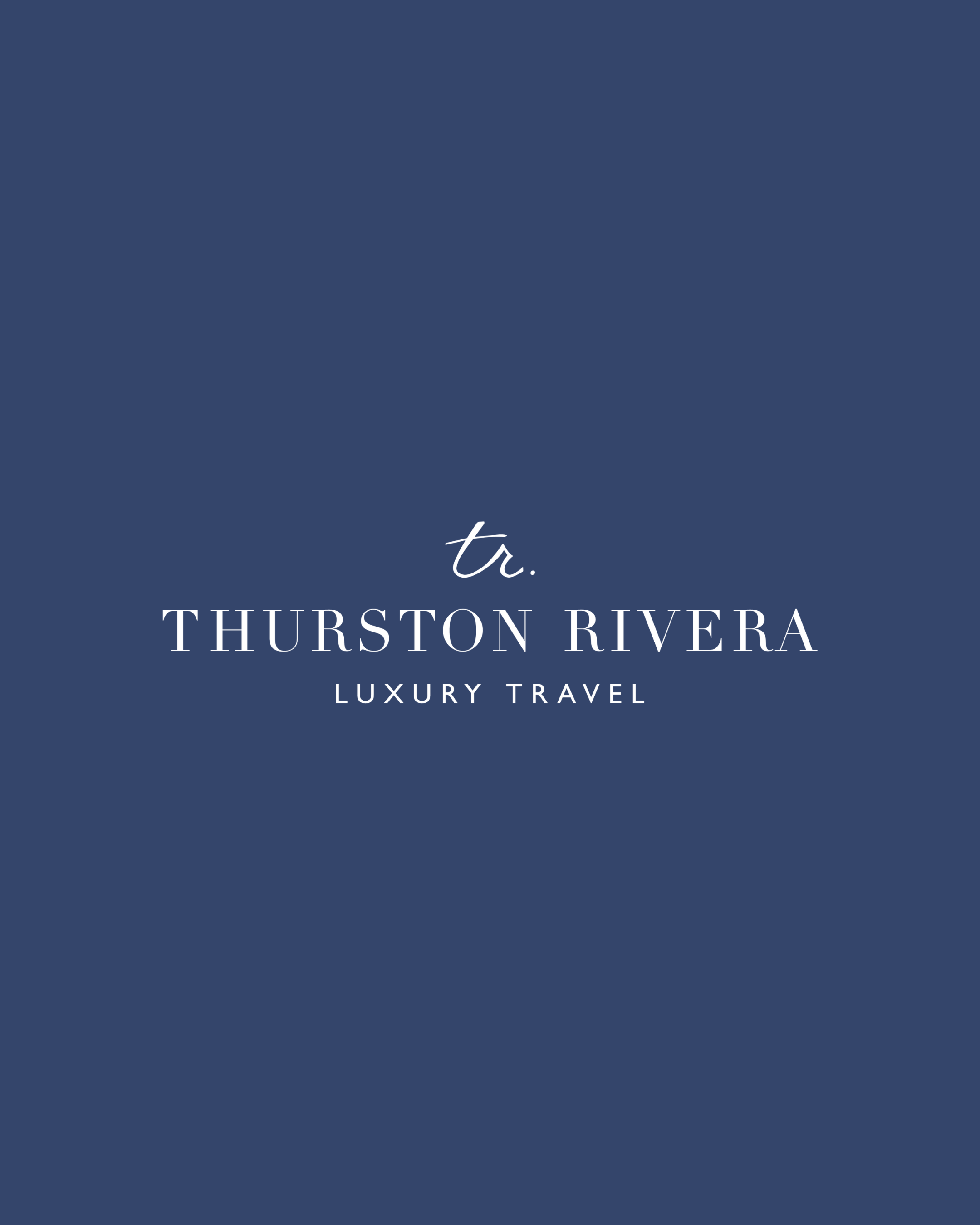
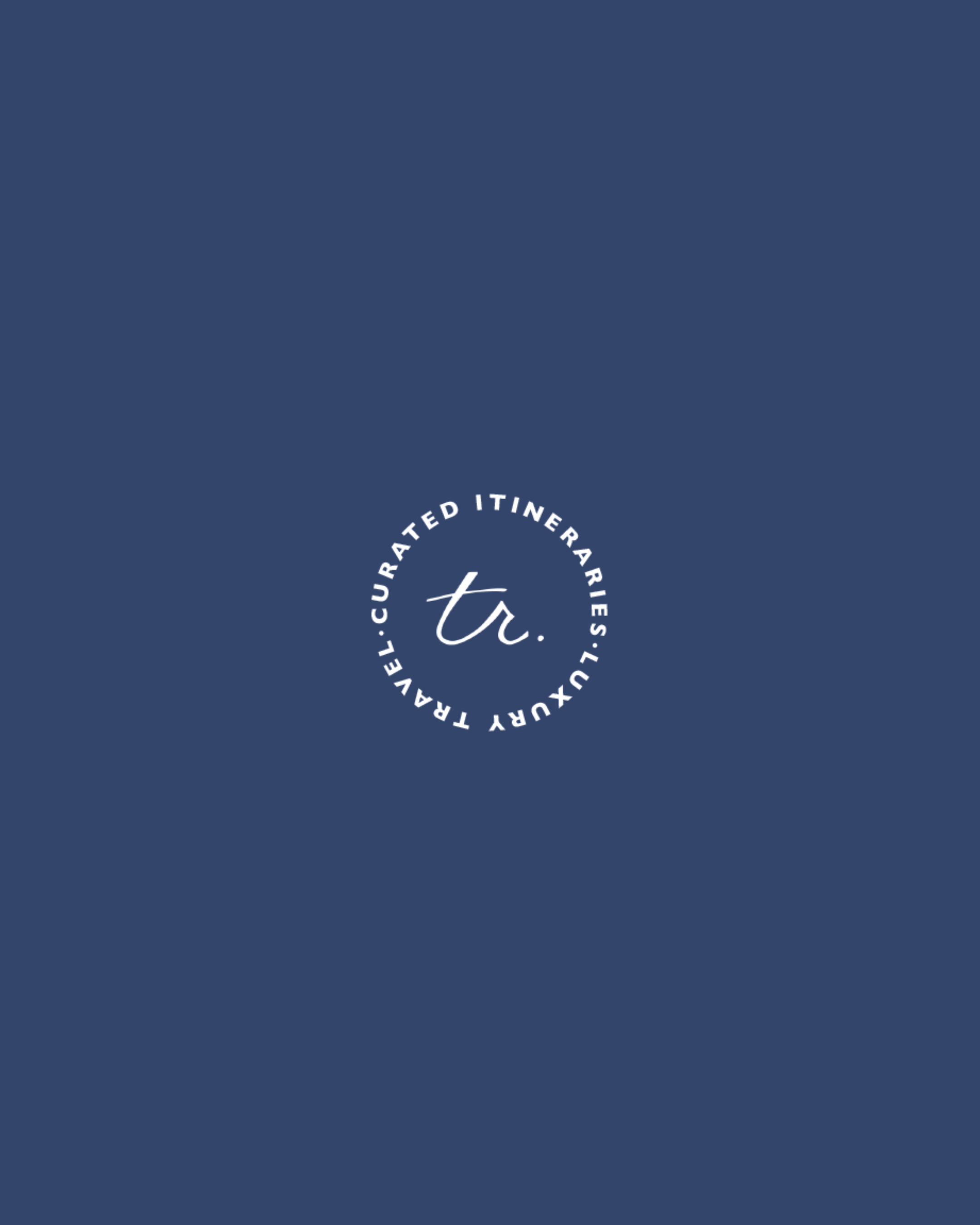
The original logo design
Here is the logo designed with the original business name.
Its design balances a clean, polished structure with a hand-drawn element, introducing contrast, tactility, and a sense of human touch to the overall identity.
Building The Brand Identity
For the brand’s visual identity, we chose colors inspired by both the energy and tranquility of the natural world and the exploration of all its environments, while the typography was meant to display an elegant feel with a personal touch.
The imagery direction feels relaxed overall, with natural colors and slightly desaturated tones.
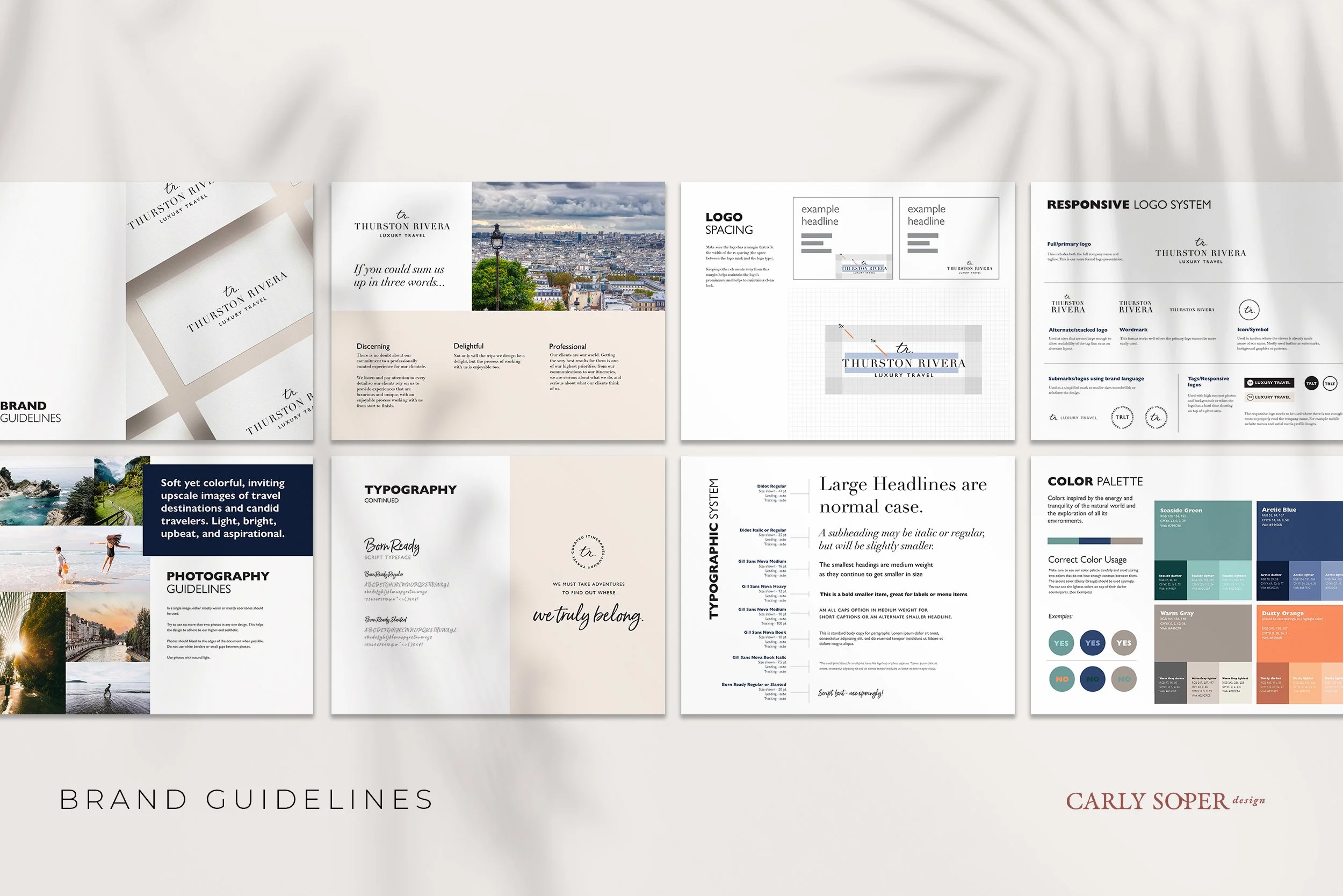
Mini Brand Guide
Full Brand Guidelines
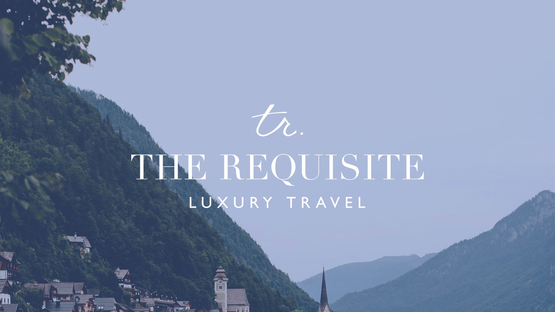
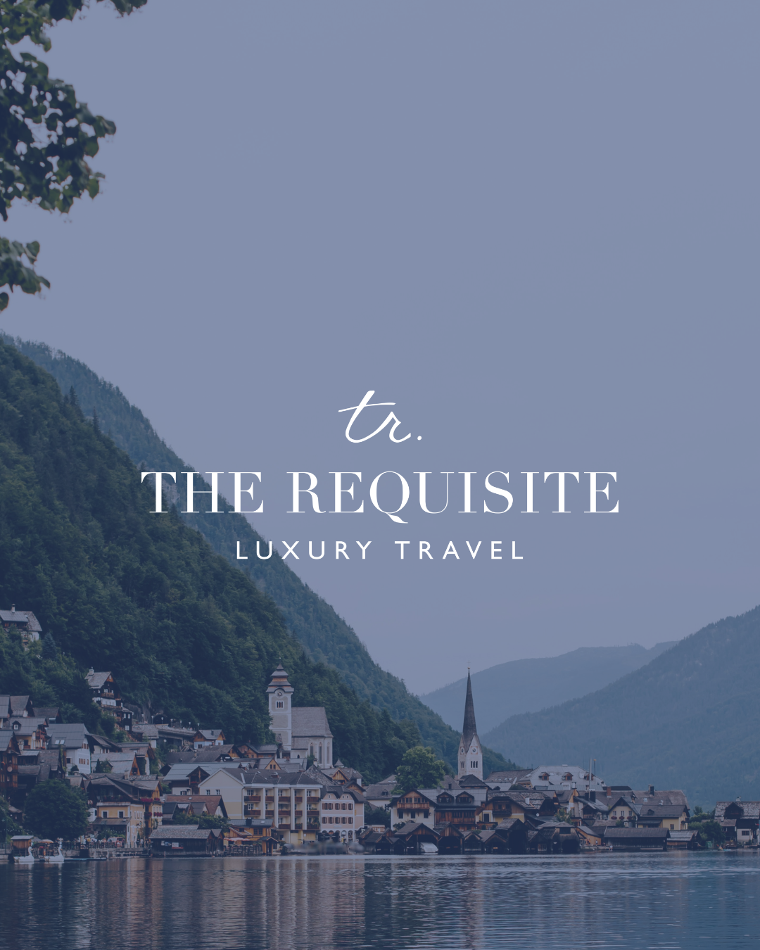
The Updated Logo
From The Client
“We’ve worked with Carly twice now, and we were confident she would deliver both times because she clearly understood our vision.
We have positioned ourselves as a strong luxury brand and have always remained consistent in voice and tone and presence – largely because of the foundation built with Carly at the launch of our business. We also loved the extras that she gave us, her brand presentations, the extensive brand kit, and the thoughtful updates to our marketing collateral. She went above and beyond, and it meant the world!
Thank you so much to Carly for seeing us through both chapters; we are so happy with our brand!”
– Trisha, TR Luxury Travel